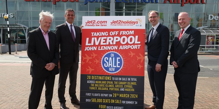
Jet2.com and Jet2holidays announce hugely expanded Summer Sun programme for 2025 from Liverpool John Lennon Airport
Jet2.com and Jet2holidays announce a hugely expanded Summer Sun programme for 2025 from Liverpool John Lennon Airport
Liverpool John Lennon Airport has today launched a refresh of its brand which will begin to be rolled out across all aspects of the business over the coming weeks and months as the airport looks to the future following a number of important business growth announcements over the past year.
The airport logo, which includes the famous John Lennon self-caricature, has undergone a subtle transformation with the illustration moving from the right to the left so that it is now at the forefront of the brand, with updated typography to make it appropriate for digital use and modernised with a block colour, rather than the red and blue of old.
The Liverpool John Lennon Airport name and the Faster, Easier, Friendlier strapline remain, as the airport continues to give passengers a seamless experience and the refresh brings new colour concepts into it including a free-flowing colour scheme called The Aura, that is a visual representation of the Faster, Easier, Friendlier experience.
Over the past year, the airport has announced a number of business developments including the re-introduction of connecting flights to the US with Aer Lingus, an increase in Lufthansa’s services and the global connectivity via Frankfurt which this brings and perhaps the most significant announcement of the past 20 years that Jet2.com and Jet2holidays will operate their newest base from Liverpool, launching their award-winning flights and holidays for Summer 2024.
LJLA has worked alongside Liverpool-based creative marketing agency Kenyons on the project.
LJLA’s Digital Marketing Executive, Tom Woods, who has led the brand refresh for the airport commented, “It is really exciting to reveal our new brand to the public. This is the culmination of months of work, so it’s nice finally to get it out there for everyone to see.
The original logo was created in 2001 before smartphones and social media, so a refresh was long overdue and now seemed like the perfect time.
This year we’ve celebrated our 90th birthday and following the launch of Lufthansa, PLAY and Aer Lingus, as well as the announcement of Jet2 we needed a brand that was ready for the exciting years ahead of us.”
Aaron McDonald, Creative Development Director at Kenyons added, “It has been a privilege to reimagine one of the most iconic names in the UK. We wanted to create a new look that represented the friendliness, positivity and vibrancy that the airport and its staff show every time we visit. The project has been a labour of love and we cannot wait for their passengers to see it.”
Jet2.com and Jet2holidays announce a hugely expanded Summer Sun programme for 2025 from Liverpool John Lennon Airport
Liverpool John Lennon Airport launches a refresh of its brand with a new logo and fresh colour concepts.
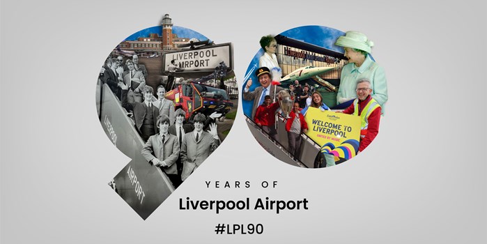
Today is the 90th anniversary of the opening of Liverpool Airport and to celebrate, a number of activities will be taking place across the Airport throughout the day.